
On our way home, my eldest muppet suddenly sprung towards the nearest bus stop. He stops in front of a printed advertisement behind a glass-covered wall. As I get closer, I notice how frustrated he is. “Mommy, Mommy, I tap and tap on the button, and nothing happens!”. The button in question was just a rectangle outline with some text in it….. But for my 5-year-old, if it looked like a button and felt like a button. So…. it is obviously a button. What does it matter for him if it is an advertisement on a bus stop or his beloved tablet, it’s all the same.
So let’s talk conventions
I am a user testing addict. It fascinates me that each finding is different. I learn something new every time! However, there is one thing in common in my findings: we are always looking for the familiar. We seek the known and the comfortable. The problem is it’s subjective; what is convenient for me will probably be difficult for someone else and Vice Versa.
We also loooooove routine and convention. If I’m used to see my shopping cart on the top left of the screen, that will be the first place I’ll look for it in any interface. Same as if I’m used to click on the arrow pointing left to go back to the previous page, my expectations will be set accordingly.
So obviously, when designing a winning interface, we can not satisfy every user’s expectation. There will always be users who feel lost in the magical digital sphere we created.
What can we do for the lost souls
Sitting here, wondering what can be done for those who slip through the pixels. We all seek an experience tailored to our needs. Let’s face it — our expectations are sometimes just too high, and our patience threshold is pretty rickety. So how can we make it easier for everyone to feel at home and want to come back?
The neon sign is flashing over my head… and the word it displays is
CONTROL
I can sense that some of you are squirming in your seat… but hold on, let me explain.
Obviously, we can’t (well, we can but better not) allow users to change and organize the interface as they please. But that does not mean we can not provide them with the sense that they are in control of the interface, which in turn instills a much-needed sense of security. And security, dear friends, is the key to everything.
A user who feels secure, feels at home. A user who feels at home will want to come back.
Are we there yet?
Believe it or not, we already do it in small doses here and there. Here are some examples:
Feed me Simor
Let’s take the ‘feed,’ naturally… whether it’s an informational feed or a product category. We allow users to control the display — a single product in A row versus several products (list/grid view).
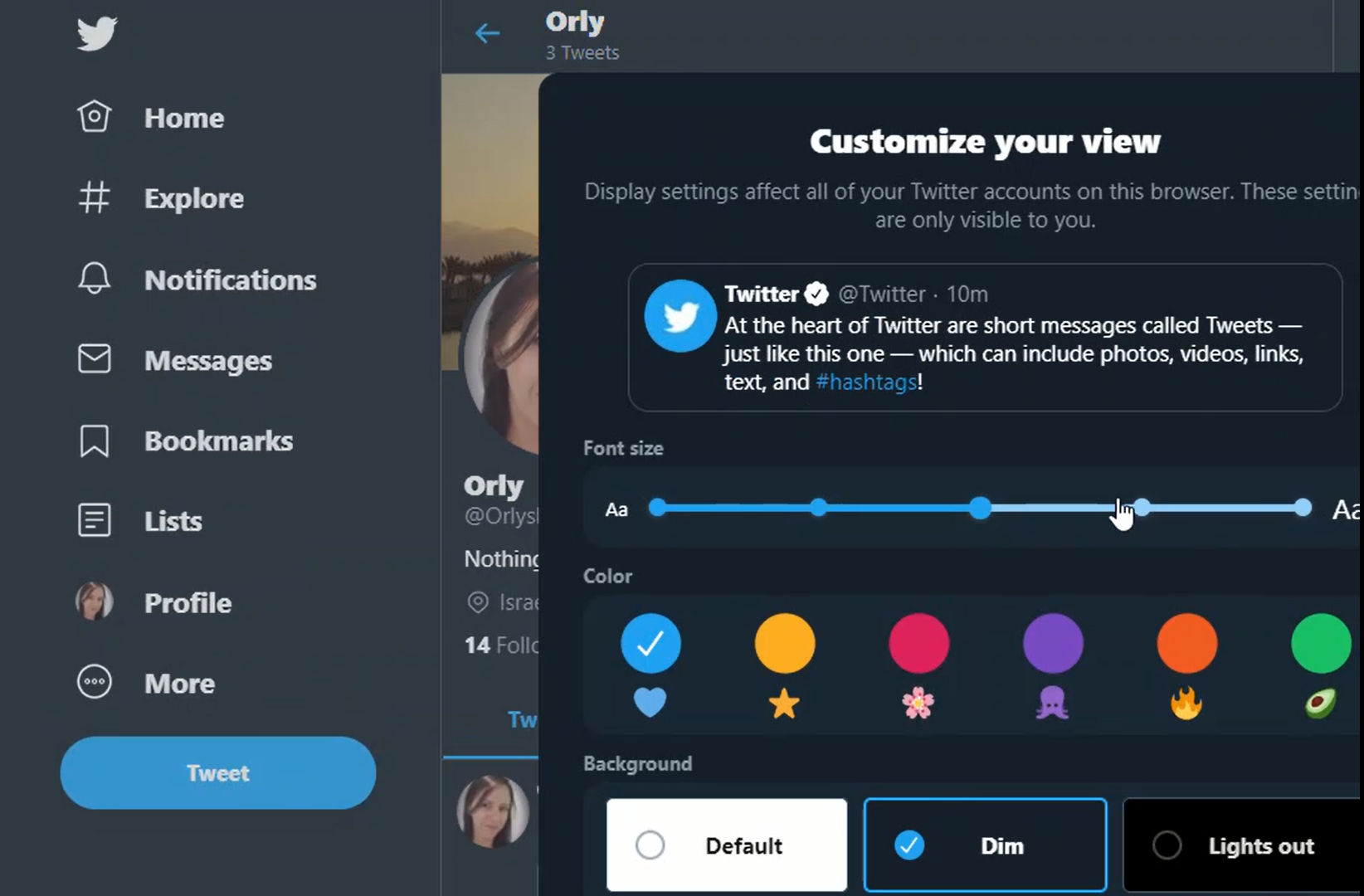
Tweet bird
I have a confession to make, just until recently, I’ve been a twitter virgin. And I must say I was pleased to find out that they totally get the idea of control. I can decide on how I want my personal interface to look and feel (not to mention all of the privacy settings). From the font size to coloring and so much more. I’m in the process of furnishing my profile, and already, I feel at home.
Video killed the written word
Numerous studies were conducted on user behavior with the written word. The facts are that the majority of people prefer video over text. Thankfully (for that tiny percentage that do actually read top to bottom), It didn’t stop Medium from letting me choose what ‘not to read’ :). I am in control of the stories and articles I receive, and even my home page delivers the goods only on what is relevant to me.
What’s in a name?
What is a home page, if not a pretty sitemap? And I ask you this: do we need it? If we want to provide real value for our users, why don’t we ask them right then and there — ‘What do you need?’, ‘How can I make it better?’
After all, most of your users begin their journeys with God (I mean Google). The filtering prosses already takes place in the search engine, and most likely, they first enter an internal page. So why not utilize the home page to get to know one another?
Humor me, hang on
Imagine the first time you visit the homepage on a website, you focus on getting acquainted. So instead of the ‘me, me, me,’ you are asked what you want, how frequently you need it, and what will improve your experience with the product or service.
Ok, ok I will draw it for you:
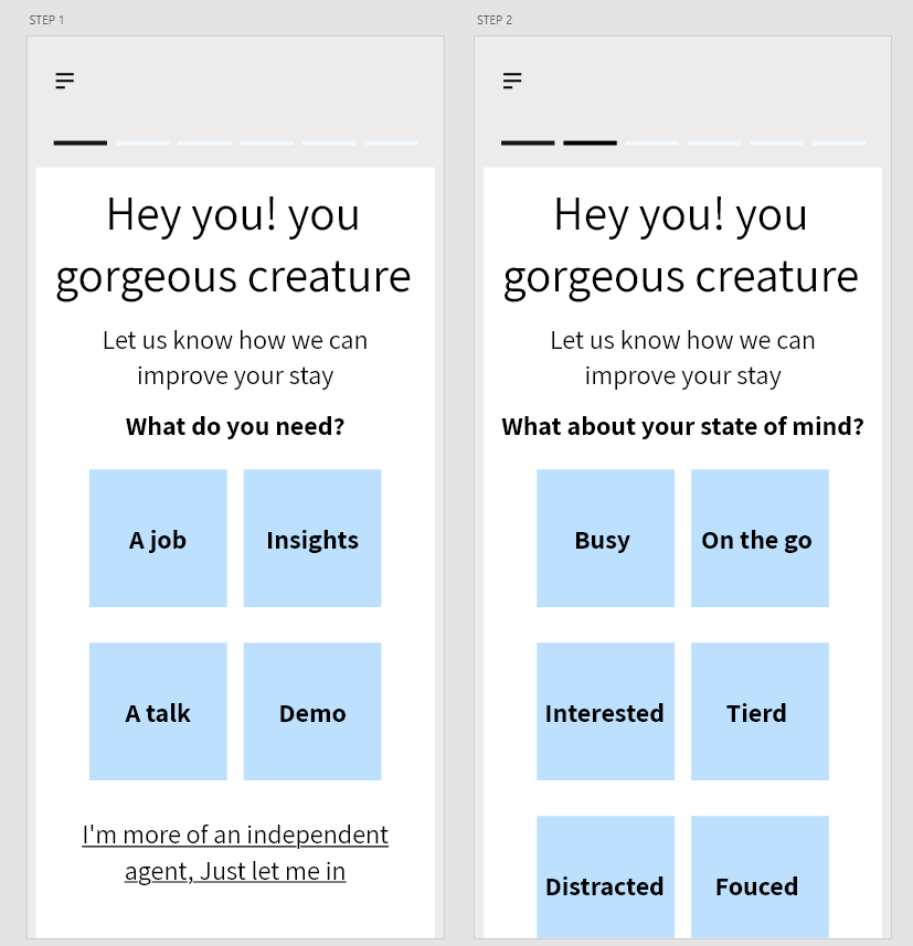
I can hear you!! all those who are now thinking: “Is this suitable for everyone?” In my opinion, the answer is yes. Brand websites, content and services providers, and any digital platform really should try it.
Why let them wonder when we can give them a choice. All we have to do is ask:
Do you want to apply for a job?
Maybe you want to be a partner or a service provider?
And if you want to become a customer, you probably have tons of questions on all the brilliant solutions we have to offer… come in I‘ll take you there.
Oh, sure, sure! You love long walks, of course, you can just roam freely!
What do you think?
Originally posted by me on Medium