
Recently, I find that there are too many things that drive me crazy — for example, the lack of a “CTRL-Z” function in an elevator, open mouth gum chewing, and the incredibly far-off development of teleporting technology.
In my long list there is a special place for sentences such as: “Oh, come on, Orly, we are MOBILE FIRST,” “Let’s just stop designing for Desktop,” “We need to start from the mobile and then spread out to wider screens.” though I understand the line of thought, there’s a BUT — do you see how bold it is?
Let’s take a moment to organize these deterministic statements;
MOBILE FIRST was founded to emphasize the importance of mobile experience. From the beginning of the smartphone era, we advanced too fast. New generations of devices appeared one after the other, springing up like mushrooms after a rainy morning, catching us a bit off guard.
Take a look at this data taken from a survey conducted by the ‘Boston consulting group.’ They wanted to check the American consumer behavior, the results might freak you out.
What would we give up for our phones?

Some additional data from the web:
● 40% of all purchases made during the last Black Friday were made on mobile devices
● 40% of all users will switch to a competitor brand following a bad mobile user experience
● 75% of all users read emails on their mobile devices
● And a mind-blowing fact — 84% of all mobile users encounter some sort of error during their purchases online
Someone, somewhere, analyzed this data and thought to himself: “ok, the answer is ‘MOBILE FIRST’!” and then started writing articles and going on roadshows and shouting it to everyone who would listen.
As with any amorphous conceptualization, it was followed by complete panic and confusion. However, and with all due respect to that someone (somewhere), ‘MOBILE FIRST’ does not mean ‘MOBILE ONLY’!
Now, if we mix it up with other “ingredients,” such as responsive, adaptive, and adjustable, well, we might have created a “long-island-iced-chocolate-beef cocktail” (yuck!).
So, let’s simplify those “ingredients” for a second:
Mobile First
We design for a mobile interface first and then move to other devices.
Responsive
The interface responds to the width of the screen and presents the elements accordingly.
Adaptive (dynamic serving)
Some code/design adaptations are made on different screen sizes to improve upon and adjust the experience and design on those devices.
Separate mobile site
This is an independent website with a different URL (m.website.com).
Not too long ago, before HTML was thriving, there were technical restrictions. Brands, afraid to miss out on the vast mobile potential, started developing independent websites for mobile, thus creating double assets and, along with it, a lot of maintenance work.
Luckily today, we can play on a single playground. On the development level, we have incredible abilities and tools, enabling us to identify the user’s device and tailor the perfect experience to their current state of mind.
And so we arrive at the main point:
I, Orly Shelef, create and design for the user’s state of mind and not for the screen width!
So what does it mean? Smart design enables us to connect to a user’s state of mind and provide them with an experience optimized for their wants and needs at that very moment.
Picture a world where it’s all kittens and rainbows, where each time we consume information or perform an online purchase, the interface will identify our current state of mind and will make the appropriate interface accessible to our needs at that very moment.
However, until that happens (on mobile devices, for instance), we must design for distraction. Yes, it’s not a mistake. We must understand that when the user is holding a mobile device, they are most likely distracted, moving around, on the go, or in the middle of something. Their level of concentration is partial, and our job, as designers, is to provide them with the ability to continue or finish what they started quickly and continuously.
Real-life scenario
The following is a scenario from my own life: the damned element whose name is forbidden to mention in my team, but for the sake of the illustration, I will write it down, the . . . The. . . The pop — (oh, it’s not easy!) ok, here we go, the pop-up (Ugh, I feel like I need a shower)!
Picture yourself in the following situation. You search online and find a fantastic recipe for chocolate cake that you would like to make for your little muppets at home. You are on a bus, just before you finish reading the article the conductor arrives (yeah, they still have those), and you are now officially distracted. Then, after you finish and go back to the recipe, you are on a different screen, one that you didn’t request or approve! They’re asking you to join their mailing list . . . ? What? Why? Why are they disturbing you while you are trying to read and plan the perfect cake for your little ones??
It’s annoying; I want to close the pop-up, but of course, the close icon is too small, and I accidentally tap somewhere else. Obviously, I’m thrown to a different page, and its time for me to get off the bus. The aggravation that follows blah blah . . . in summary, bummer!
The solution to the scenario that I presented is an expression that we should all embrace and make a beautiful screensaver of at the office: design for a state of mind.
Designing while thinking about the state of mind is crucial because the data is indeed eye-opening.
As a reminder, an average of 75% of the primary traffic to your websites comes from mobile devices (it probably grows as I write these words). That being said, to do a good job, we need to dive into our mobile user’s behavioral characteristics:
I’m in a hurry.
I’m distracted.
I’m in the middle of something.
I’m doing something for a while now.
Not everything accessible is comfortable
Contrary to our experiences on the desktop, when the main mediating factors are the keyboard and the mouse, the mobile experience is much more physical. There’s direct hand contact with the screen (and we weren’t all blessed with tiny gentle pianist fingers).
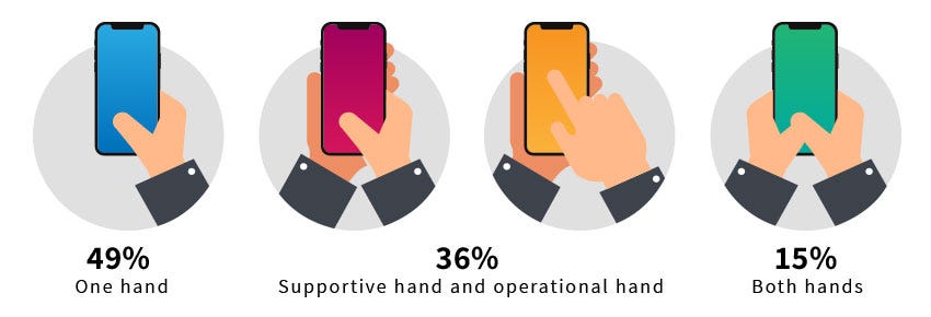
Note that 50% of the users on mobile devices cannot click what they need to select due to size or incorrectly placed elements. Not to mention the need for speed.
The technical challenges are vast.
Guys, the bottom line is that the decision to purchase, carry out, or apply and all that is functional on a digital interface is a journey and not a sprint, and we must pave this route while thinking of what’s relevant to users and what they need in any and every mindset.
That’s why we don’t only focus on the size of the device. Until we create holograms and flip our hands in the air like we just don’t care, it’s essential to design for a state of mind. For the walkers, the runners, the drivers, those being one with the couch, and the super busy ones.